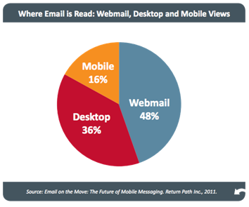
The mobile email revolution is upon us! This is evident, as the percentage of people reading email on mobile devices is on the increase. This means that now, more than ever, Marketers have to ensure that their email communications are optimized for mobile viewing.
In this edition of eMarketing Insight, Alison Treadaway, Managing Director at Striata, identifies 7 ways to ensure your emails get read on mobile devices.

Are you ready for the Mobile Email Revolution?
You may think you have missed the boat, but won’t know this until you make an effort to find out – firstly, you need to establish where the majority of your customers are reading your emails. Track which device or channel your customers use to open your emails – mobile, desktop, webmail. Then using campaign history, establish whether these are active users (how many are opening your emails, how many click on links and complete the call to action such as purchase your product, provide their contact information, etc.). You may find that you’re just in time to make the appropriate changes to your communications in order to ride the mobile email wave.
It is important to note that mobile readers will delete / ignore emails that aren’t optimized for their device. If you’re lucky, they may come back to your email once they have access to their laptop/desktop, but there is no guarantee!
7 ways to adapt your emails for optimal presentation on mobile devices:
The most important driver of mobile email design is the fact that the screen is small and the reader is distracted.
- Sender name and subject line become all important, because of the way an email is presented on a Smartphone. Subject lines have to be shorter (as little as 15 characters) to get the message across in a smaller space.
- A single column design is preferable, so that the reader does not have to scroll left to right.
- Be frugal with graphics: Large images cause slow downloads and can obstruct the message.
- Don’t embed images, as they will not show on all mobile devices. Embedded images increase mail size, which impacts on download time. Linked images are the way to go.
- Links must be easy to click with a “fat finger” on a small screen. Don’t place links close together.
- Remove fixed width tables to eliminate the scrolling scenario when an email has been designed for a bigger screen.
- Don’t forget to optimize the pages behind the links too. There is no point having a mobile perfect email and clicking through to a landing page that doesn’t render well.
Ensuring that your emails are designed optimally for mobile devices will not only warrant the success of your mobile marketing campaigns, but will also ensure that your customers have a positive experience with your brand.
It’s time to embrace the mobile email revolution – your customers will give you the thumbs up!
Improve the customer experience with secure document delivery today


